Data Science
Learning by Doing: Apra’s Inaugural Data Science Dashboard Challenge
By Michael Pawlus | November 17, 2020
The Challenge
Recently, Apra unveiled their very first interactive data science challenge. Participants were given a shared dataset and asked to design a dashboard. The dataset contains constituent and fundraising data for a fictional organization.
The main challenge was to display year-to-date fundraising progress, however, participants were encouraged to go farther. Dashboards were judged based on data accuracy, dashboard design, data visualization and usability. The top four participants were featured during Data Science Now, which took place in October.
The Winners
The winning submissions chosen this year were:
- Kelly Douglas and Derrick Fang from CalTech


Kelly Douglas, Derrick Fang
- Aksana Lishko and Christa Kimmel Zufelt from Phillips Andover Academy


Aksana Lishko, Christa Kimmel Zufelt
- Max Dakin from The Kennedy Center and Nicole Wittlin from Southern Methodist University


Max Dakin, Nicole Wittlin
- Amber Palmer from Queen’s University

Amber Palmer
Connections recently had an opportunity to meet with all four winning teams to discuss why they chose to take on this challenge and what the learned from this opportunity.
Why Participate?
The participants mentioned several reasons for why they entered this challenge. Lishko and Kimmel Zufelt noted it was a breath of fresh air to design with no limits on creativity. Dakin and Wittlin had a similar reaction, enjoying the opportunity to work with data with an unknown structure and a different context, relative to the data they work with regularly.
Kimmel Zufelt and Lishko thought it was helpful to collaborate on this project. Having accountability to your teammate was a motivator to finish the competition. This sentiment was also captured by Dakin and Wittlin, who do not work at the same organization but teamed up to complete this challenge and found working together to be really helpful.
For Douglas and Fang, another motivator was being able to use Tableau’s latest features. Almost all teams completed the challenge using Tableau, however at many organizations there is a development lifecycle. This means the newest version of the software is not immediately installed and used, but rather software updates are completed on a scheduled basis. As a result, this challenge allowed Douglas and Fang to use new features and functionality that they cannot currently use.
Palmer was similarly motivated to try new ideas, such as sheet swapping to bring in different Top 5 lists and building a hex map. She felt this challenge provided her with a reason to discover new approaches to designing visualization, utilizing the very active Tableau developer community forums.
The Dataset
This competition was the first offered by Apra with a shared or common dataset, rather than their own data. The lack of a shared dataset has often been a barrier for collaborative, external learning. There are so many nuances to the way data is stored within each organization and, of course, the need to keep certain information confidential.
Palmer found she was so used to working with her own data that she enjoyed not having that familiarity to fall back on when values looked incorrect. Others found the data very clean and easy to join and use. There was also a lot of appreciation for the data dictionary provided, which clearly described all fields included.
The goal of this challenge was to offer an opportunity to learn while doing, and to that extent it was a success. Working from the same dataset made it easier to understand others’ work and learn from each other more quickly. While many of the teams felt they all created something similar, they also made some different choices and all the teams enjoyed seeing these variations.
Dakin and Wittlin were the only winning team to not exclusively use Tableau for the final dashboard. Wittlin has more experience with Excel, which she feels is an important piece of software to know since not every organization has Tableau. Dakin, for his part, also found the data discovery exercise to be thrilling. This echoes the feelings of other teams who enjoyed working with different data.
Many design choices were on display among the four winning teams, as well. Palmer worked toward a minimalist design. She included details in action buttons to cut down on using too much space, noting that the goal is to not overwhelm the user. “Users may want a dashboard to answer every question, but trying to do everything means doing nothing at the same time,” she explains. Palmer also shared another design insight regarding explainer text, noting that she will use more explainer text for reports that are used less frequently and include less of such text for more heavily used reports.
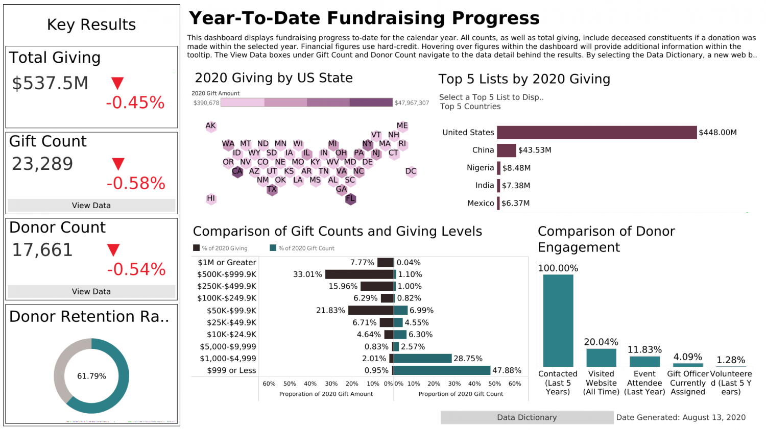
Amber Palmer’s dashboard.
Dakin and Wittlin took their visualizations and placed them on an executive one-pager. They had a similar idea to Palmer in trying to answer a specific question for a specific user, but went with a different approach. They organized their final report to flow like a story, starting at the highest-level overview and then going into more details, showing gaps and opportunities to reach goals which would help someone in leadership to make decisions.
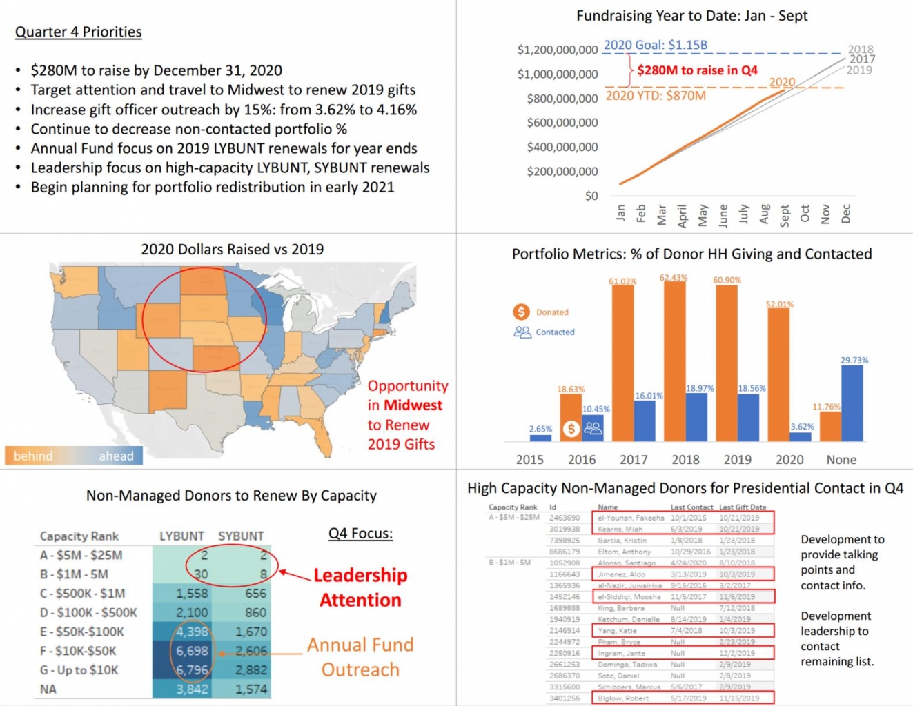
Max Dakin and Nicole Wittlin’s dashboard.
Douglas and Fang designated one part of their project to look at the diversity of the donor base for this fictional organization — a view that received many compliments. The duo designed this sheet using the marketing rule of thirds, where elements are placed between lines drawn over the page at each third. They also provided more text than they might otherwise, noting there can be great value in giving users full sentences and more detail when possible. They also shared an insight regarding the radio buttons on the home page for their project. These provided all choices without needing to click to discover which can be helpful for an end, leaving all options present and available.
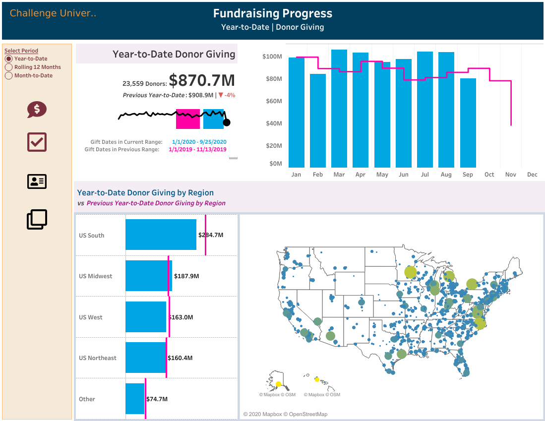
Kelly Douglas and Derrick Fang’s dashboard.
Kimmel Zufelt and Lishko designed their final project using the story feature in Tableau, which many other teams thought worked well. This allows for including many dashboards and letting the user navigate between them, with a bar along the top of the report. The pair liked this feature so they could keep each dashboard focused on a particular topic. They approached the challenge by trying many ideas and then selecting the best ones and organizing them into themes.
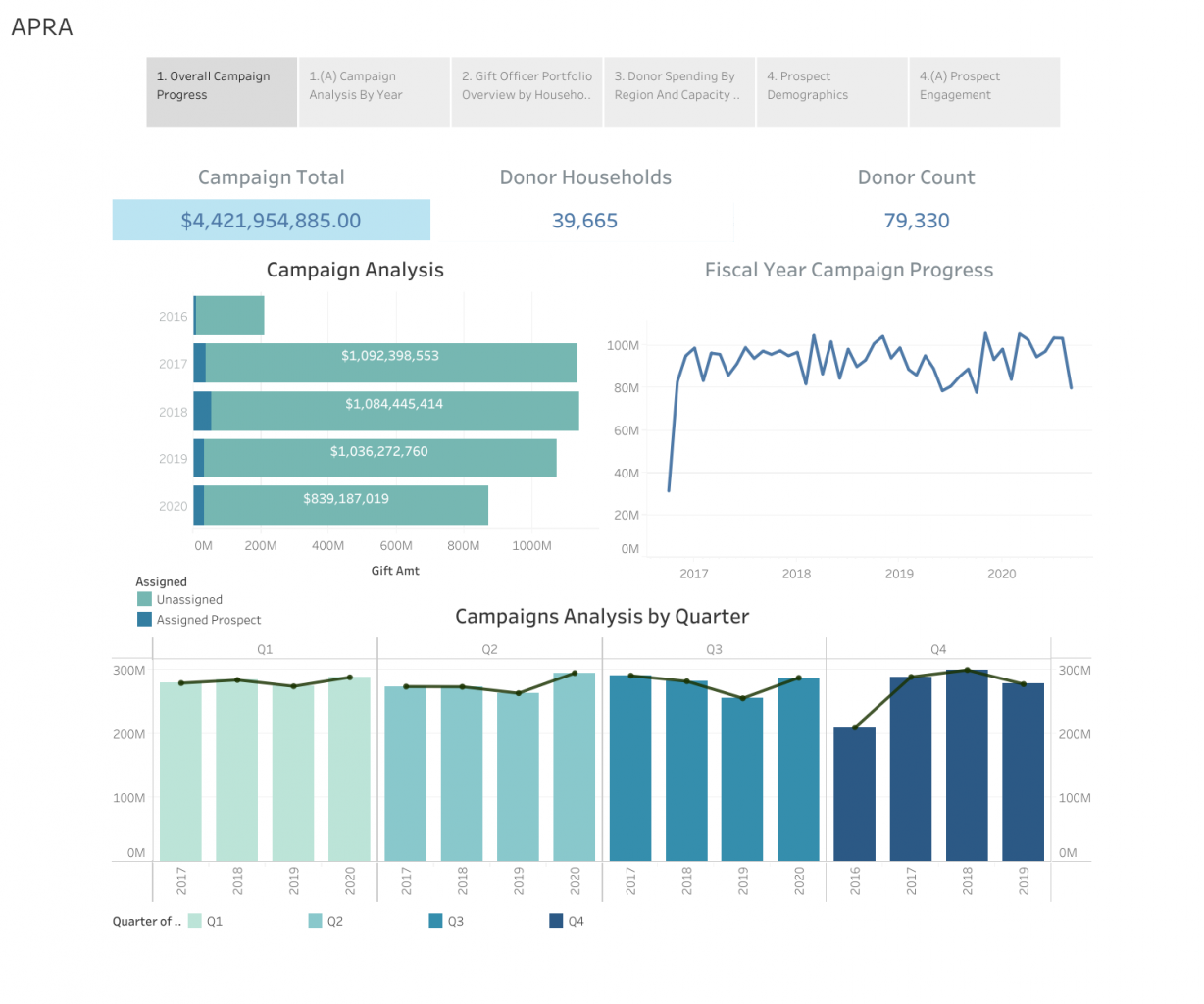
Aksana Lishko and Christa Kimmel Zufelt’s dashboard.
Continuing the Challenge
The winning dashboards for this challenge all envisioned a specific audience and then designed dashboards that answered questions they thought would be relevant. All noted how their visualizations were designed to prompt action by showing trends and opportunities. However, there was a wide amount of variation in how these teams created their final projects.
Between new data, unlimited creativity and collaboration, all the teams reported having fun with this challenge while growing their skill sets. Given the success of this challenge and now having a shared dataset, there will certainly be another call to create before long.
Will you join in next time and take on the opportunity to learn while doing with Apra?

Michael Pawlus
Data Scientist, University of Southern California
Michael Pawlus is a data scientist at University of Southern California. Prior to this, he was the director of prospect development at The Trust for Public Land, and before that the assistant director of prospect research and development at Grand Valley State University. Michael is chair of the 2018 Data Analytics Symposium planning committee. Michael has a master’s degree in librarianship from the University of Sheffield and a bachelor’s degree from Grand Valley State University.